Hazard zoning
Probabilistic hazard maps of SO2 ground concentration for Holuhraun eruption
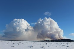
During the Holuhraun eruption (August 2014 - February 2015) huge amounts of volcanic gases were released into the atmosphere. The total amount of SO2 has been estimated to be 11 Mt (+/- 5 Mt) for the entire duration of the eruption (Gislason et al., 2015).
SO2 can have human and animal health implications when present in high concentrations. For this reason, IMO was asked to provide hazard maps for SO2 ground concentration at local and regional scale. The maps were produced using the dispersal model CALPUFF. The maps were used to identify and draw the no-access area around the eruption site by the Icelandic Civil Protection throughout the eruption.
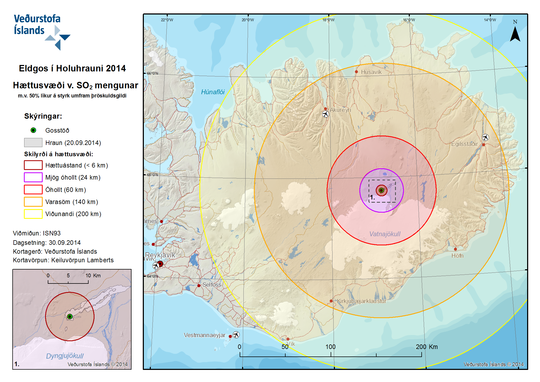
Preliminary maps were produced considering a short meteorological data set (one month); and were only done for 50% and 90% likelihood of occurrence.
A more proper data set of runs was done using 10 years of meteorological data from the ECMWF and probabilistic hazard maps accounting for seasonal variability have been produced. The CALPUFF model has been initialized with SO2 flux data as coming from the DOAS monitoring system (Gislason et al., 2015).
Maps based on ten years of meteorological data
Each map below shows the likelihood that at a specific location the hourly ground concentration of SO2 will exceed a specific threshold. The threshold values are shown in bold blue in the legend (left part of the map) and in the figure caption (the phrase below the map). The colour scale reports different values of likelihood (under 1% has no colour).
The maps have been made considering 10 years of meteorological data and computing the ground concentration each hour with the CALPUFF gas dispersion model. The results have been plotted considering the wind variability across a year, or its variations with the season. The maps are available in small and large domain.
The numbers reported in brackets on the large domain map correspond to the number of times that some UST stations (marked with grey dots) measured a concentration higher than the threshold the map is referring to. The numbers refer to hourly averaged concentration of SO2.
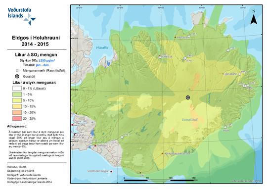 At a specific location across the country, how likely is it that the the hourly SO2 concentration exceeds the threshold of 350 µg/m³ considering the wind variability over an entire year? (above, enlarge)
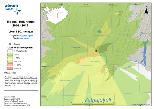 In the vicinity of Holuhraun, how likely is it that the hourly SO2 concentration exceeds the threshold of 2600 µ/m³ considering the wind variability for the seasonal spring period, March-May? (above, enlarge)
Older maps based on one month of meteorological data
Presented here are two maps showing concentric zones of increasing risk of dangerous SO2 levels, the closer you get to the eruptive site. First a map of Iceland meant for the public (50% risk) and then a zoom in towards Holuhraun meant to inform authorized personnel (90% risk) and assist in decision making with regard to closure and evacuation.
 A map showing 50% likelihood of crossing threshold values (enlarge).
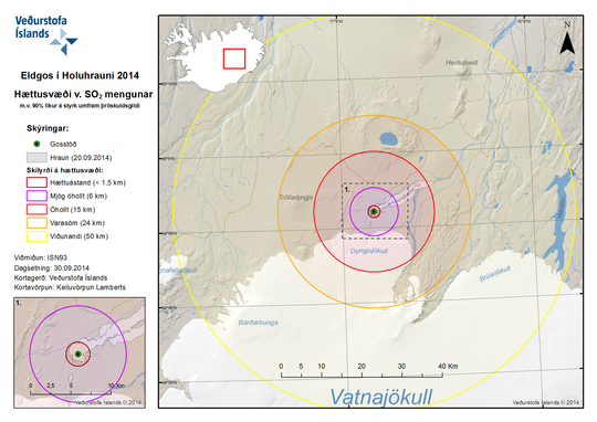 A map showing 90% likelihood of crossing threshold values (enlarge).
Legend
The threshold values and their colour code are based on the EAI scale for air quality:
- Hættuástand = Danger levels (over 5 ppm or >14,000 µg/m3)
- Mjög óhollt = Very bad for public health
- Óhollt = Bad for public health
- Varasöm = Fair for the healthy. Bad for those who are sensitive or prone to respiratory problems
- Viðunandi = Good (under 0.1 ppm or <300 µg/m3)